C09: Scattergrams
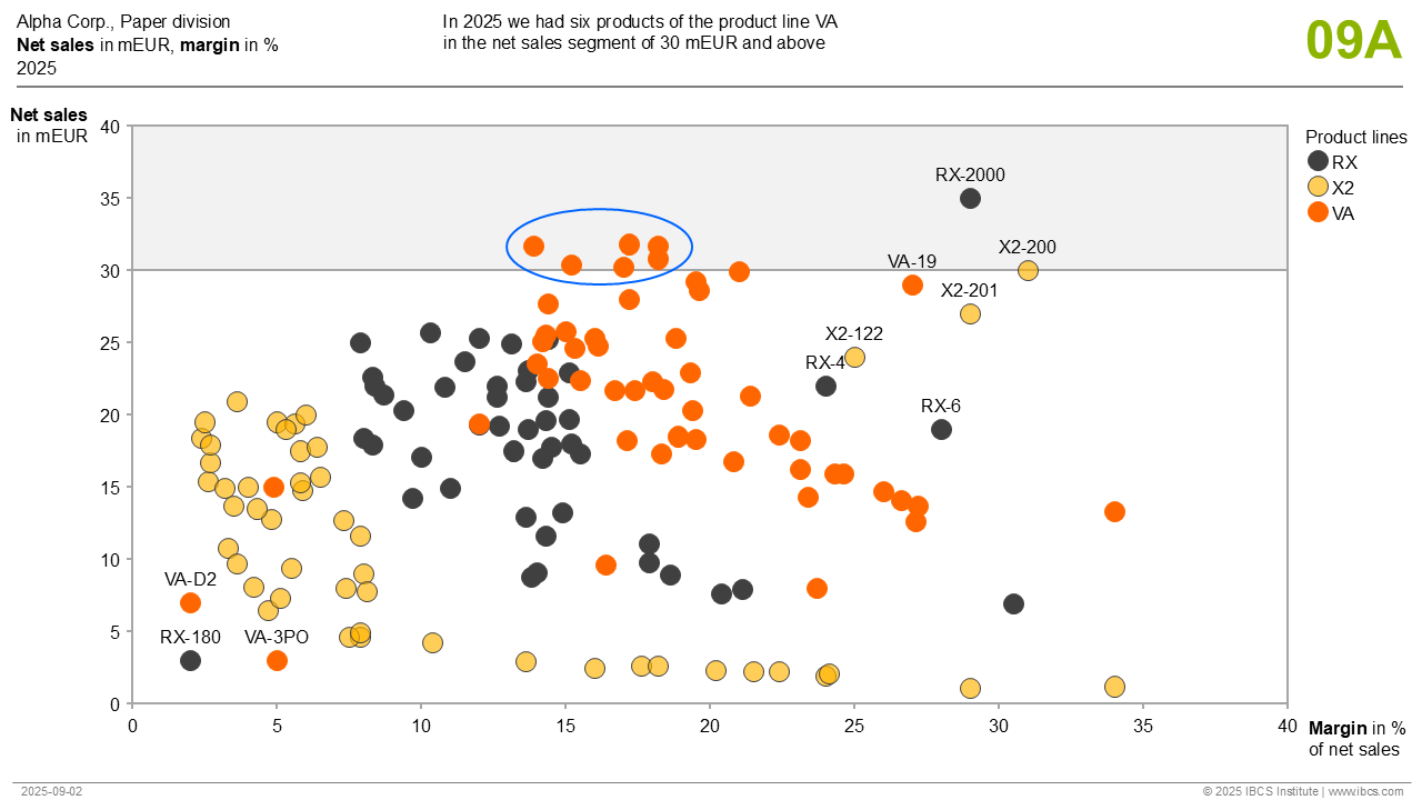
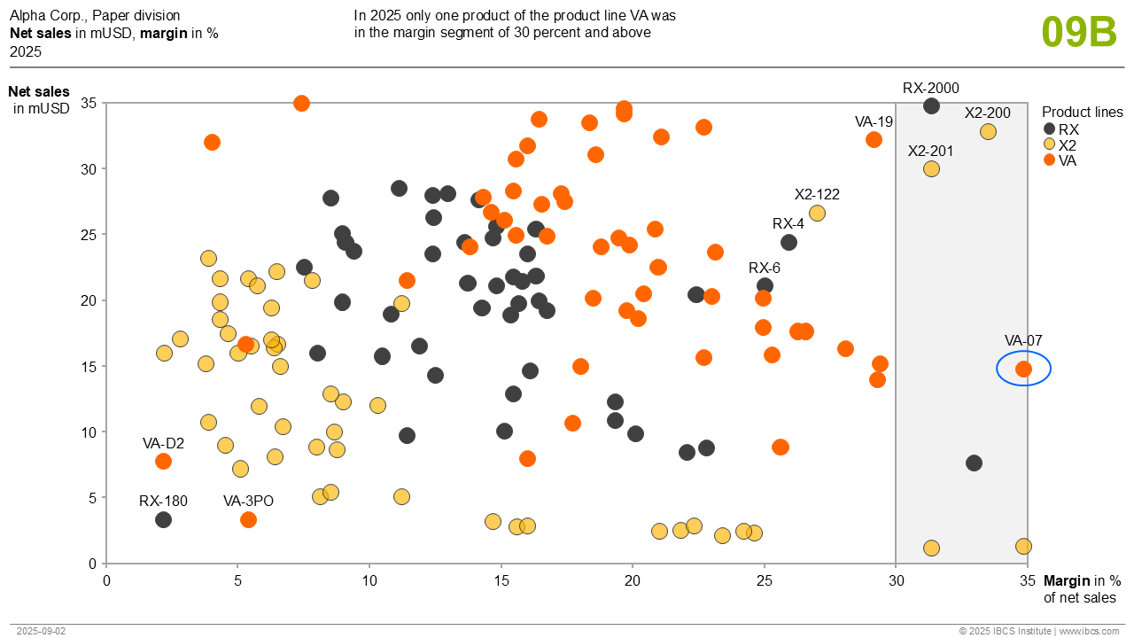
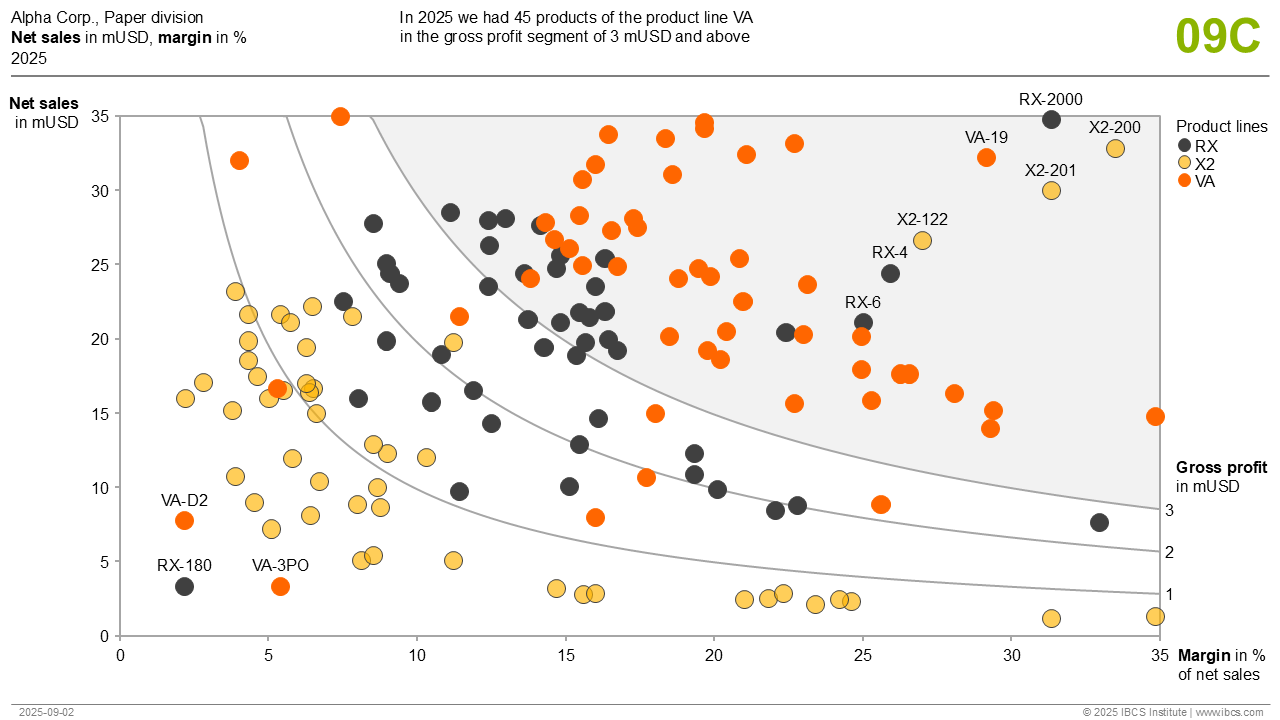
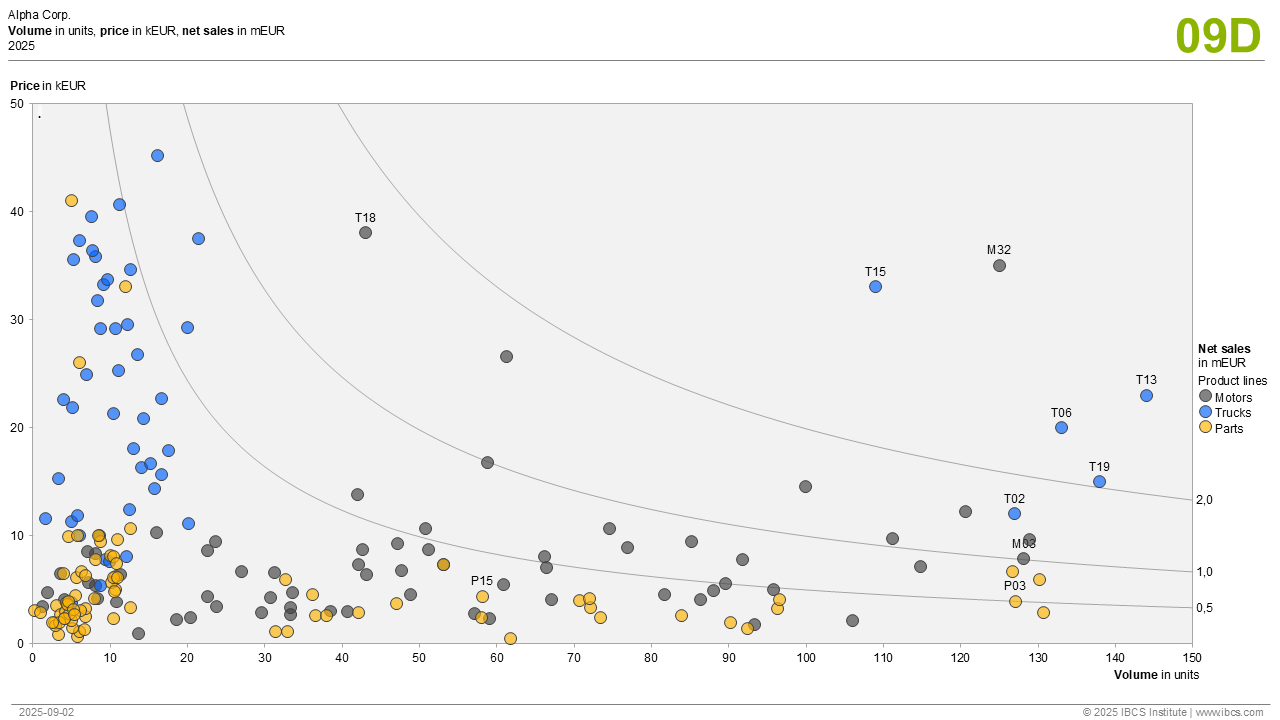
This template arranges data points for “Net sales” and “Margin” in a chart with two value axes.
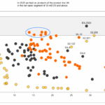
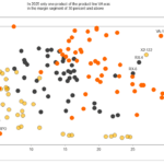
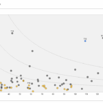
The colors of the data points indicate the respective product lines. The diagram is clustered by hyperbolic lines of equal “Gross profit”. This chart type can be used best, if the two measures presented can by multiplied in order to show a third interesting measure (here: Gross profit). The number of data points can be from a very few up to a few hundred or even thousand.


Features for IBCS® certification of software
Required
- Legends inside or outside the chart explaining different colors or shapes
- Selective labeling of data points
- Data point labels close to the visualizing elements
- Consistent title and footnote concept
.
.
Optional
- Message concept
- Integrating and highlighting comments (not here)
- Highlighting areas between the hyperbolic lines

