


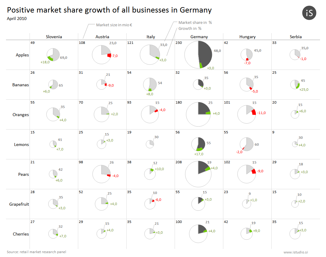
In this experiment, we have visualized integrated deviations with pie charts. Pie charts in general are a poor visualization method, but by placing them in small multiples, we increase information density. Such a report would typically be based on bar charts, but this solution is still intuitive and informative. It was well received by our clients, so we have used it several times, mainly in marketing and market research analysis.