
Markus Wolff
Markus Wolff is Co-Founder and Managing Director of chartisan GmbH, a service provider for data visualization and reporting solutions.
About
As a Co-Founder and Managing Director of chartisan GmbH, the goal of Markus Wolff is to support professionals at the widest range of organizations as a consultant and implementer for visualization and analysis of data in commercial contexts. He also supports the evaluation and implementation of specialized software tools.
Since many years he is a specialized consultant and trainer for the implementation of business reports according to the SUCCESS rules of IBCS®.
Markus was also Co-Founder and Managing Director of HI-CHART GmbH. Before his current specialization he worked as a group controller at Saubermacher AG in Graz and as a lecturer in vocational training. In a number of projects he was responsible for the conception and implementation of tools and processes for business analytics, planning and reporting, based on Microsoft Excel as well as ERP and BI tools from major vendors like SAP, Microsoft and Infor.
He studied business administration at the University of Applied Sciences in Eberswalde, Germany, and at the Danube University in Krems, Austria. His particular strength lies in the interdisciplinary cooperation, especially between IT and business management.
Markus is one of the first IBCS® Certified Consultants and IBCS® Certified Trainers, giving both the IBCS® Certified Analyst training and courses on ‘Excel charts and dashboards’.

IBCS® Certified Trainer
Markus Wolff has successfully completed the IBCS® certification for successful design of reports and presentations at the IBCS Institute in July 2010. Since January 1, 2020 he serves as IBCS® Certified Trainer.
Work samples
The following work samples were created in Microsoft Excel without macros and without VBA, using only the Tips and Tricks which are explained in the HICHERT+FAISST Excel training courses and in the corresponding book.
Markus will be glad to make these Excel files available for participants of our Excel training courses or people who have studied the book. Please contact him accordingly.
-
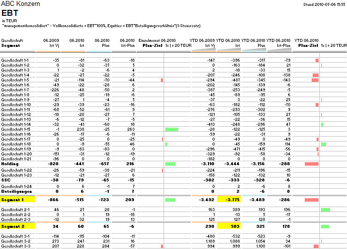
Deviation table A comparison of key performance indicators for previous year, budget and current values is visualized here as a table. The bar chart was created with a red-green logic using the repeat function and can be copied in any number of rows very quickly. The visualization is well suited, for example, as a company overview in a monthly report.
-
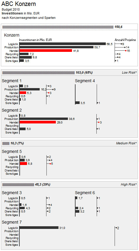
Combination chart A combination of bars and scatter charts shows the distribution of investments in various company segments with different risk assessments. The investment volume and the number of investment projects are displayed for each segment. Naturally, all charts have been given the same scale.
-
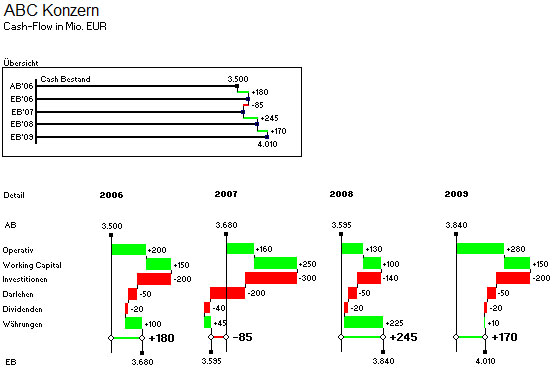
Multi-waterfall The development in liquid funds is visualized graphically. The fact that the cash-flow was quite small in relation to liquid funds presented a particular challenge. The solution consisted of two parts: An overview displaying absolute amounts correctly and a detailed visualization of the cash-flow.
-
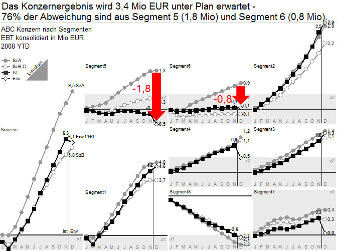
Charts with scaling indicators This group overview has several particular features: Scaling with enlargement scales (x2, x4) – visualized with gray background areas, visualization of outliers, and visualization of several scenarios through line charts with different formatting. Also, the entire visualization is so compact, that it fits quite legibly on one single PPT slide.
-
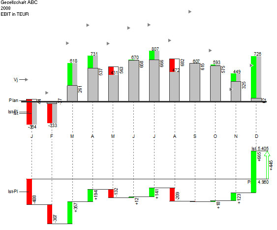
Integrated deviations This visualization illustrates quite clearly the deviations between the previous, budget and actual values of a key performance indicator – e.g. EBIT. It also shows the deviation in the form of a waterfall. The graph is well suited for explaining deviations.


