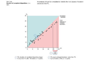
The original scatter chart shows five dots representing 57 completed dispositions, which obscures data for 91% (52) of the completed dispositions. A statistical technique (kernel density estimation) was used to estimate planned and actual durations, enabling analysis of all completed dispositions. This standardized presentation introduces several valuable improvements. An actionable message helps focus decision-makers. A collectively exhaustive representation of all completed dispositions reinforces trustworthiness. A regression analysis reveals one of the root causes of the variances from planned durations. Accessibility-considerate colors immediately convey the implications of actual durations. Dots for in-progress dispositions were removed, as they were deemed unhelpful based on the regression analysis. Finally, two insightful callouts expedite understanding.


