


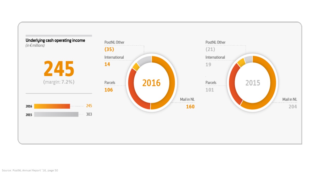
E.g. depicting PostNL’s UCOI figures (including one negative amount!) with usage of a set of twin pie charts is possibly the best way to make all our stakeholders do all the work in deriving the enclosed messages themselves.
E.g. depicting PostNL’s UCOI figures (including one negative amount!) with usage of a set of twin pie charts is possibly the best way to make all our stakeholders do all the work in deriving the enclosed messages themselves.