Andrej Lapajne
Andrej Lapajne is founder and CEO of Zebra BI. Zebra BI is a software company developing an Excel add-in, focused on empowering users to create standardized and impactful reports and presentations, which meet the IBCS® guidelines.
About
Management information design is Andrej’s great passion where he combines his knowledge of computer science, painting, visual communication and controlling. He has implemented reporting systems for major Slovenian companies in pharmaceutical, telecom, retail, FMCG, manufacturing, media, insurance, banking, energy, public administration and high tech industries. He has also worked for international companies like Coca-Cola, Sandoz, SandvikCoromant, Hypo Alpe-Adria Bank, Danfoss, Saubermacher, Atlantic Group and others.
Andrej studied computer science and painting. He has also finished studies at the School for Controlling in Ljubljana (a franchise of Controller Academie) and is a member of International Institute of Business Analysis (IIBA). He received training from HICHERT+FAISST in 2007 and has worked extensively with the SUCCESS formula of IBCS® ever since.
With more than 15 years of experience in IT, he has gained advanced knowledge of MS Excel, SharePoint and other reporting software. He is also an Excel trainer. He is currently working on his Ph. D. at the Faculty of Computer Science and Informatics, University of Ljubljana.
Andrej systematically explores information design, especially the opportunities of its use to support business decision making. He is a lecturer on information design at the Faculty of Computer and Information Science and Faculty of Economics in Ljubljana. In his academic research, he focuses on visual languages, the criteria of effectiveness of visual constructions and eye-tracking experimental research.

IBCS® Certified Consultant
Andrej Lapajne has successfully completed the IBCS® certification for successful design of reports and presentations at the IBCS Institute in August 2013.
Work samples
All samples are produced with Zebra BI.
Excel reports
-
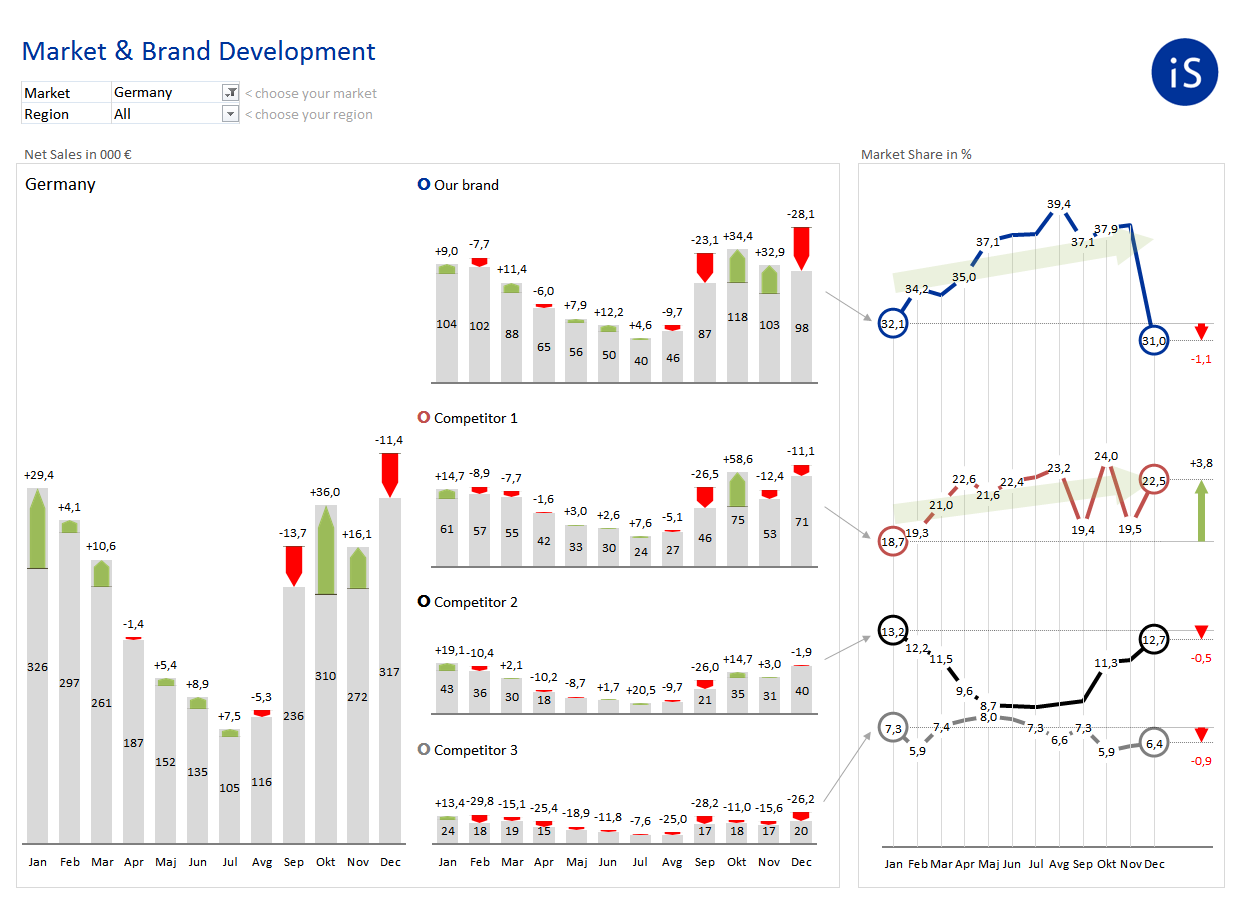
This is an exercise in scaling. All column charts are scaled, even though they have different heights. This allows the reader to directly compare the values, while the charts occupy the optimal amount of space on the report. The color-coded markers beside the brand names help the reader to link the brand sales with corresponding market share developments on the right side.
-
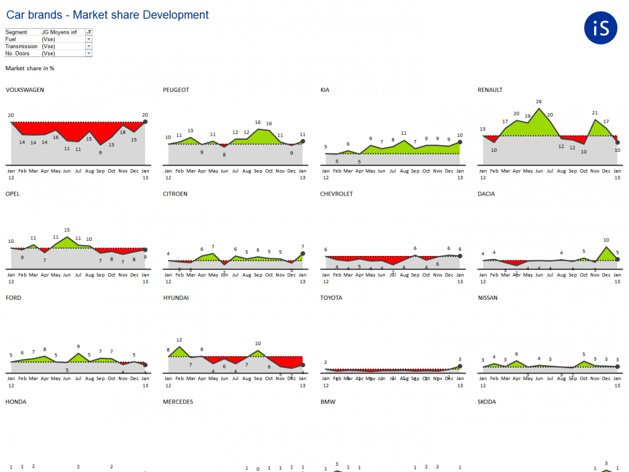
This small multiples report was generated with our new rapid reporting Excel add-in with 1 single click (it took exactly 8 seconds to produce it). It presents market share developments of different car brands on the market. All charts are scaled and ordered by the current market share. It is an interactive Excel dashboard, where all charts dynamically adjust when the user changes filter values (selects a market segment and/or different car features).
-
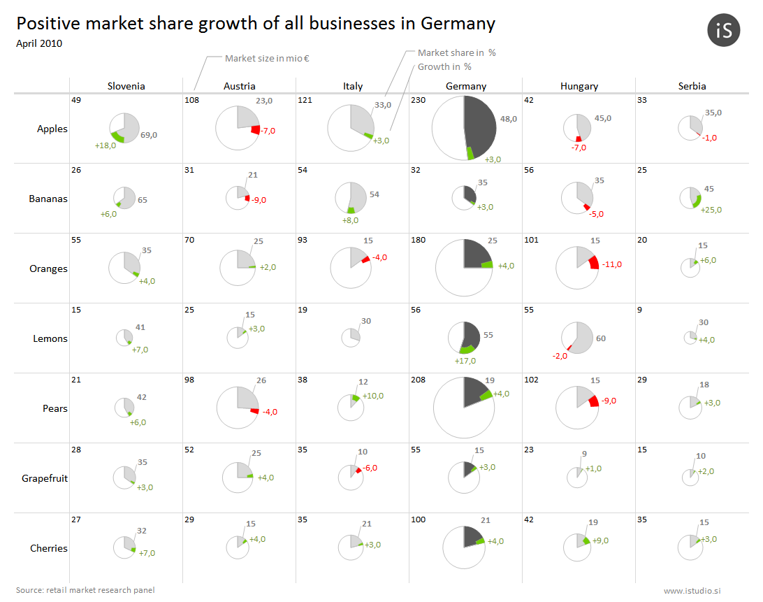
In this experiment, we have visualized integrated deviations with pie charts. Pie charts in general are a poor visualization method, but by placing them in small multiples, we increase information density. Such a report would typically be based on bar charts, but this solution is still intuitive and informative. It was well received by our clients, so we have used it several times, mainly in marketing and market research analysis.
Analytical dashboards
The following examples are from a company-wide interactive dashboard, implemented in MS SharePoint and Excel Services.

-
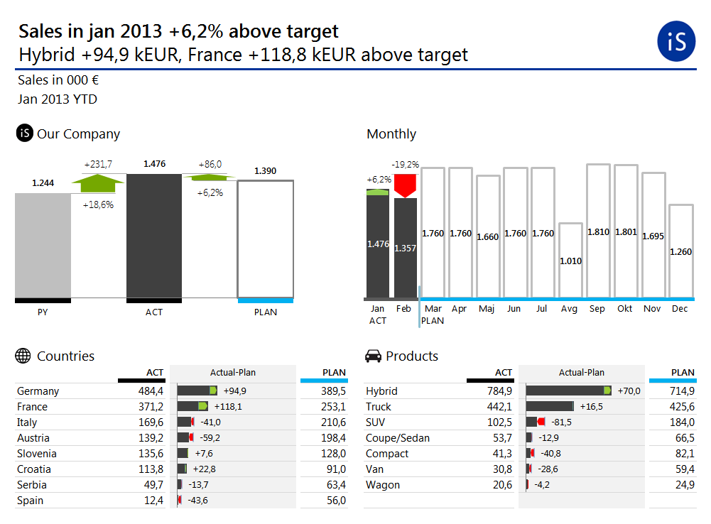
This first picture features an overview of sales actual vs. budget achievement. By clicking on the labels inside the report, the user gets more detailed analyses.
-
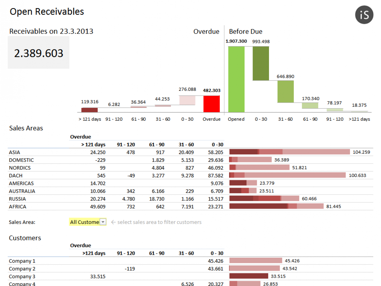
Here we presented receivables. Overdue receivables are visualized in red color while before due receivables are green. Different color hues (lightness/darkness) represent the aging structure of receivables (e.g. dark red = old receivables, more than 120 days overdue).
-
Lapajne_Dashboard
Reporting 2.0
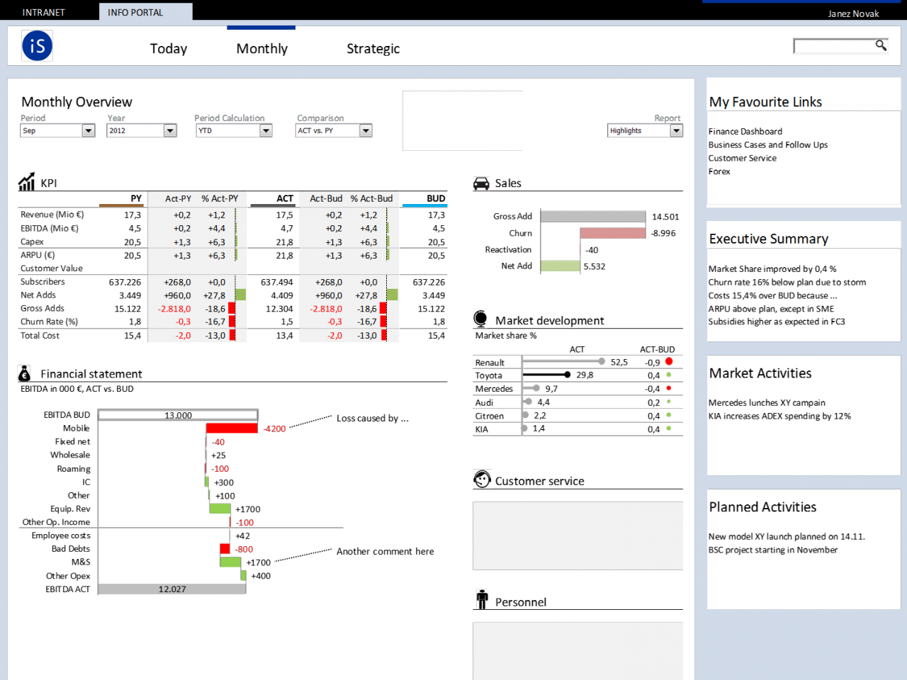
The key goal of this solution is to overcome the pitfalls of a typical analytical dashboard: there are little or even no messages, comments or explanations. Therefore, we have developed a solution (implemented with MS SharePoint and Excel Services) which we call “Reporting 2.0”. We integrate Excel reports with a social collaboration platform in such a way that the managers get highly personalized quantitative and qualitative information. All information is accessible to end-users via a standard web browser. Since the SharePoint knows who the end-user is, it can present only relevant information to him.
Controlling department, market research analysts and HR specialists regularly write internal blogs, messages and comments. In this way, the people with most knowledge in the company actively contribute written explanations to the dashboard, answering the big “Why?” question in advance. The messages are tightly integrated with dynamic Excel reports and targeted to specific user groups. All comments are at the same time links to in-depth articles on the subject.
