
Jeff Polack
After leaving McKinsey & Company, Jeff founded NovoAcuity, a boutique consultancy specializing in Decision Intelligence (DI), Presentation Intelligence (PI)™, the application and implementation of AI, data and analytics transformations, and change management.
About
Jeff blends 30+ years of experience in financial services and multi-sector data consulting with Agile principles as a translator and facilitator for executives and data and analytics teams.
He is passionate about helping clients evolve confidently in the AI Era while reducing stress by creating cultures of trustworthy decision-making.
That motivation inspired him to create the Decision Intelligence-to-Presentation Intelligence (DI2PI)™ framework. DI2PI™ governs decision-making and data and ensures the creation of certified, insightful presentations, like regulations protecting the food and drugs we consume. This governance improves lives by reducing stress and boosting confidence.
Jeff uses the IBCS® standards and the Presentation Intelligence (PI)™ framework to help clients reduce cognitive burdens and biases and move quickly to action.

IBCS® Certified Consultant
Jeff Polack has successfully completed the IBCS® certification for successful design of reports and presentations at the IBCS Institute in November 2024.
Work samples
McKinsey & Company published “Ending the confusion in Cloud Transformations: The dashboards and metrics everyone needs” in May 2024. This persuasive and well-reasoned publication offers advice about how dashboards can be used to make “a credible case, based on clear ROI data, for substantial new investments.”
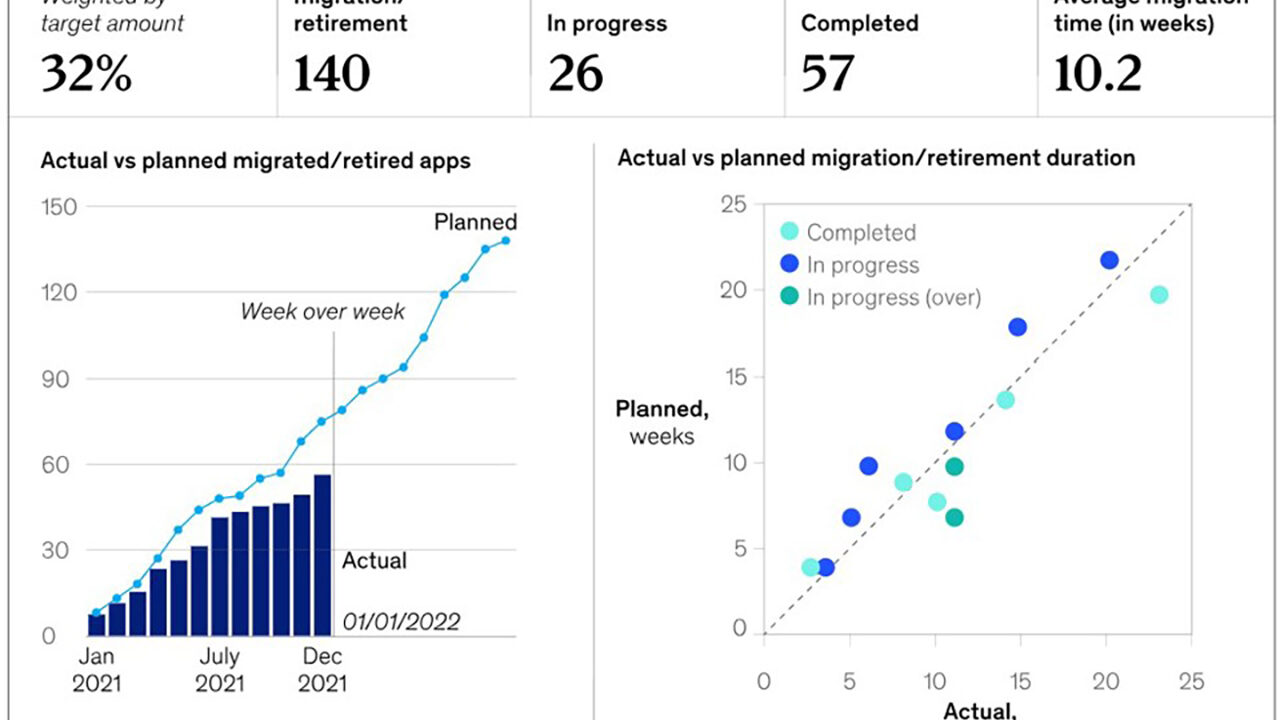
Illustrative dashboards were provided. One provided data regarding a hypothetical initiative to migrate or retire data-related software applications. While not intended to be comprehensive, the example exhibits common dashboard shortcomings that can be overcome by applying the IBCS® standards. Demonstrated improvements include increasing information density while mitigating cognitive loads and providing actionable insights.


-
Slide 1 This is a replication of the critical elements of the published example dashboard.
-
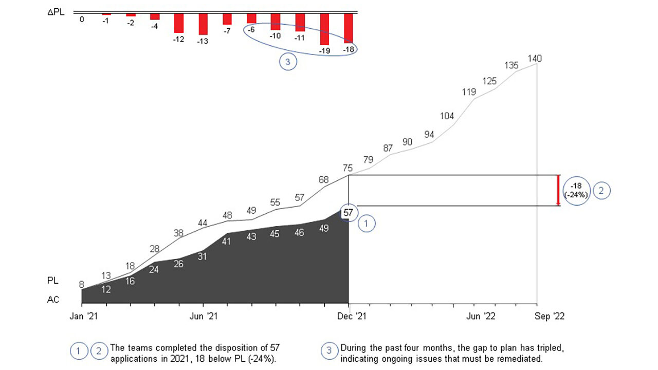
Slide 2 This standardized version of the “Actual vs planned migrated/retired apps” visualization introduces several valuable improvements. An actionable message helps focus decision-makers. The area chart allows for intuitive observations, removing the need to process 12 columns of data. Data labels enhance information density by replacing 21 uninformative dots, eliminating the need to guess sub-optimal Y-axis values, and removing distracting grid lines. Additionally, they replace space-wasting KPIs at the top of the dashboard. The variance visualization removes the need for mental calculations, enabling precise trend analysis. Finally, three insightful callouts are included to expedite understanding.
-
Slide 3 The original scatter chart shows five dots representing 57 completed dispositions, which obscures data for 91% (52) of the completed dispositions. A statistical technique (kernel density estimation) was used to estimate planned and actual durations, enabling analysis of all completed dispositions. This standardized presentation introduces several valuable improvements. An actionable message helps focus decision-makers. A collectively exhaustive representation of all completed dispositions reinforces trustworthiness. A regression analysis reveals one of the root causes of the variances from planned durations. Accessibility-considerate colors immediately convey the implications of actual durations. Dots for in-progress dispositions were removed, as they were deemed unhelpful based on the regression analysis. Finally, two insightful callouts expedite understanding.
-
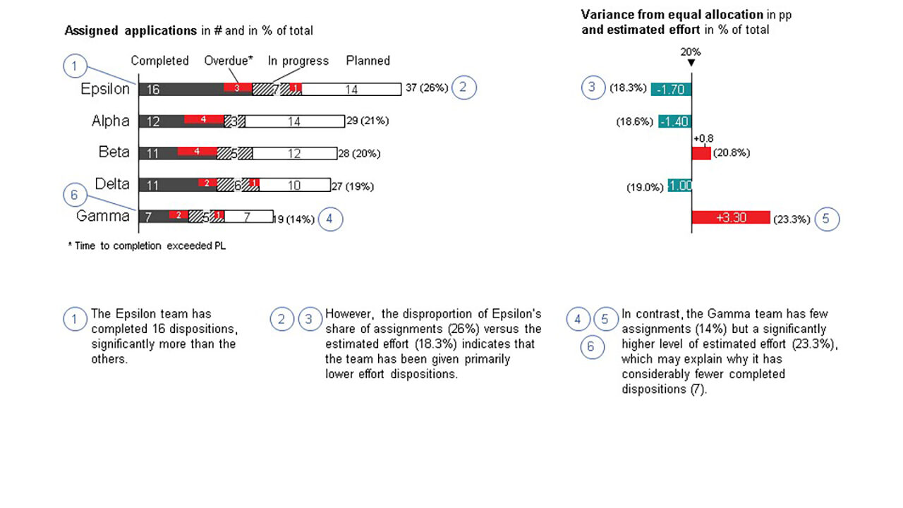
Slide 4 The original dashboard indicates that 140 applications are in the initiative's scope, and 26 are in progress, implying 57 are in the backlog. The statistical estimates included expected levels of effort for all dispositions, which were randomly distributed across five hypothetical teams. The additional data enabled an analysis that revealed a second root cause of the variance from planned durations. This page includes easy-to-understand visualizations and six callouts that reinforce the actionable message.
-
Slide 5 Application of the IBCS® standards ensures the effective use of presentation space to provide actionable insights while mitigating cognitive burdens. Including the vital features of the standardized examples would significantly enhance the illustrative dashboard.


