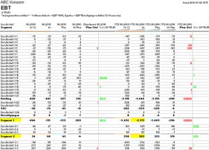
A comparison of key performance indicators for previous year, budget and current values is visualized here as a table. The bar chart was created with a red-green logic using the repeat function and can be copied in any number of rows very quickly. The visualization is well suited, for example, as a company overview in a monthly report.

